The Food and Drugs Authority (FDA) has rebranded, with new logos, key visuals, and brand guidelines to improve service delivery.
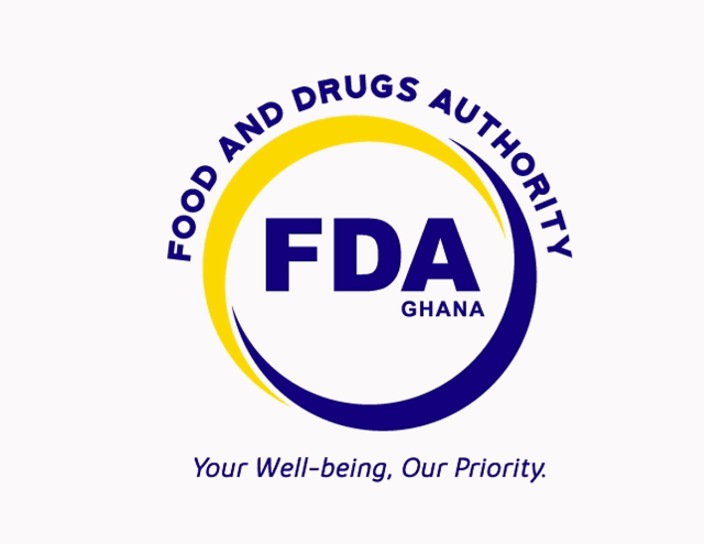
The logo consists of two arcs in yellow and blue which form a circle around the acronym, “FDA”, which is also spelt in full in the shape of an arc above the circle.
The interlocking arcs symbolize the FDA’s willingness to embrace engagement with stakeholders. The full circular shape of the arcs represents the complete 360 required checks the authority conducts to ensure consumer well-being.
Within the circle, “Ghana” sits beneath the ‘A’ of FDA to specify the geographical location of the brand.
The new tagline is empathetic and compelling which sits boldly under the lower arc forming a part of the logo.
Together with the bold brand colours, the new logo carries a sense of authenticity and warmth. The colour palette fully represents the corporate identity, that is, Blue for Bold, Yellow for Vibrant, Black for Authority and White for Transparency.
The Authority says it believes in innovation hence felt the need to refresh the identity with a new logo that speaks to the values and one that is simple and clear.
“The rebranding will breathe new life into our authority’s public interface. It will position the FDA as an evolving brand that moves with the times and remains relevant in a changing business environment.” The CEO, Delese Darko said.
She added that this was part of FDA’s recently-celebrated 20th anniversary so the new logo and brand identity reflect its renewed purpose for the future; reflecting its expanded operations, values and regulatory philosophy.
The FDA has however assured that it remains the regulatory body for food and drugs administration in Ghana and continues to improve on its service delivery.
The Authority expects the brand refresh to drive a similar improvement in attitude and behaviour of staff.

